

When we set off on our journey to start this agency we had huge ambitions and a lot to learn. With so many incredible developers within Melbourne, Australia our biggest challenge was going to be standing out. We spent hours putting our minds together, discussing the tech we knew was available to us and how we could leverage technology to help us differentiate ourselves from other Melbourne Web Developers. The answer became clear quite quickly, so we took action.
What was the answer you ask? There was a defined gap in the market within Melbourne, every single competitor of ours was only offering WordPress development for small and medium businesses meaning it was hard to compete with large corporations using the latest technology. However, with Gatsby JS this no longer needed to be the case. Hence, our biggest competitive edge was born, we could offer our clients a website that was faster, more secure, easier to manage and were future proof at the same price or at the start a lot, a lot less than our competitors. Our nativity was thinking this was all we needed for success...
We took a while to learn the ropes of running our own digital agency and learned a lot. We became painfully aware of scope creep, however, we wanted to create the best possible outcomes for all our clients no matter what. Since then we have improved our proposal process to ensure both parties understand the end goal, however, it is impossible to illuminate scope creep so we have become skilful in approaching those difficult conversations with clients to ensure the best possible outcomes.
A summary of our starting point:
- Chosen Tech
- Gatsby JS (based on React JS)
- Netlify
- Storyblok CMS
- Shopify
We have also updated our own website... A lot. We have come a long way and as a web development agency, one of our biggest assets besides our skills is our website. It is the first impression our customers have, it gives us the opportunity to get in front of new customers and it is the best place for us to experiment with new technologies before we propose our crazy ideas to our incredible clients!
Our First Website - 2018

We loved our first website, we created a morphing animation, that had great hover effects and a unique menu design. So what was the problem? Whilst we loved it, no one else did. The feedback was that it was a little bit too unique. Nonetheless, we loved this website and put a whole lot of love into creating it. This feedback stumped us, and as such was never pushed live.
Even in our earliest days, our website was built using Gatsby JS yet admittedly our understanding of how to fully unlock the features of Gatsby did not come all at once, it took a while with developing with Gatsby JS to fully leverage all of its powers. With that said even without fully leveraging the incredible features available, this Gatsby JS website far outperformed even the best WordPress equivalents.

Our first website was amazing in that it brought us our first clients, gave us a space to improve and ultimately was an incredible launch pad for our agency. We look back on this website with pride as well as confusion in that we are unsure why we ever ditched it as out of our own last three websites excluding our current website it is still our favourite.
Two Steps Forward, One Step Backward - 2o19
Our second website was great for a couple of reasons, but not great for some other reasons. Yes, we make mistakes. The way the website was built was almost perfect using the best technology to its maximum potential. This improved our search engine ranking giving us greater exposure. We also spent time creating new content for various key terms, to help other developers trying to learn how and why they should utilise these new technologies and also content designed to assist Melbournians looking for a website in making the right decision.
So where did we fail? We believe the design of our website lacked inspiration, sure it was pretty cool, had some fun animations and presented the right information. However, it was a combination of way too many styles and was the opposite extreme of our first website.
The hero of our website was engaging as the different text was written and backspace before finally welcoming you to Ten Squared. We also incorporated a clear call to action and an intuitive menu to assist people when navigating through our website.

Our services were outlaid clearly and each had a dedicated page with content designed to educate prospects on how we approached each of these services.
A Small Evolution - 2020
We worked on the 2nd version of our website for some time, making incremental improvements and bringing it closer to our vision. We added even more animations and created a website that showcased our digital expertise, but with each addition, the overall design became more confused.

We incorporated a background animation across the website to make it feel consistent, looking back we have learned a lot from this experimental website and have come a long way thanks to it. We also saw a large jump in enquiries from local businesses with our focus on local SEO.
In addition to dedicated pages for each of our services, each of our projects at the time had its own dedicated page. These pages described our approach to each of these projects, giving an overview of what we did, why we did it and how it was done. They also broke down the technology used such as Gatsby JS for service-based sites and Shopify for e-commerce websites.
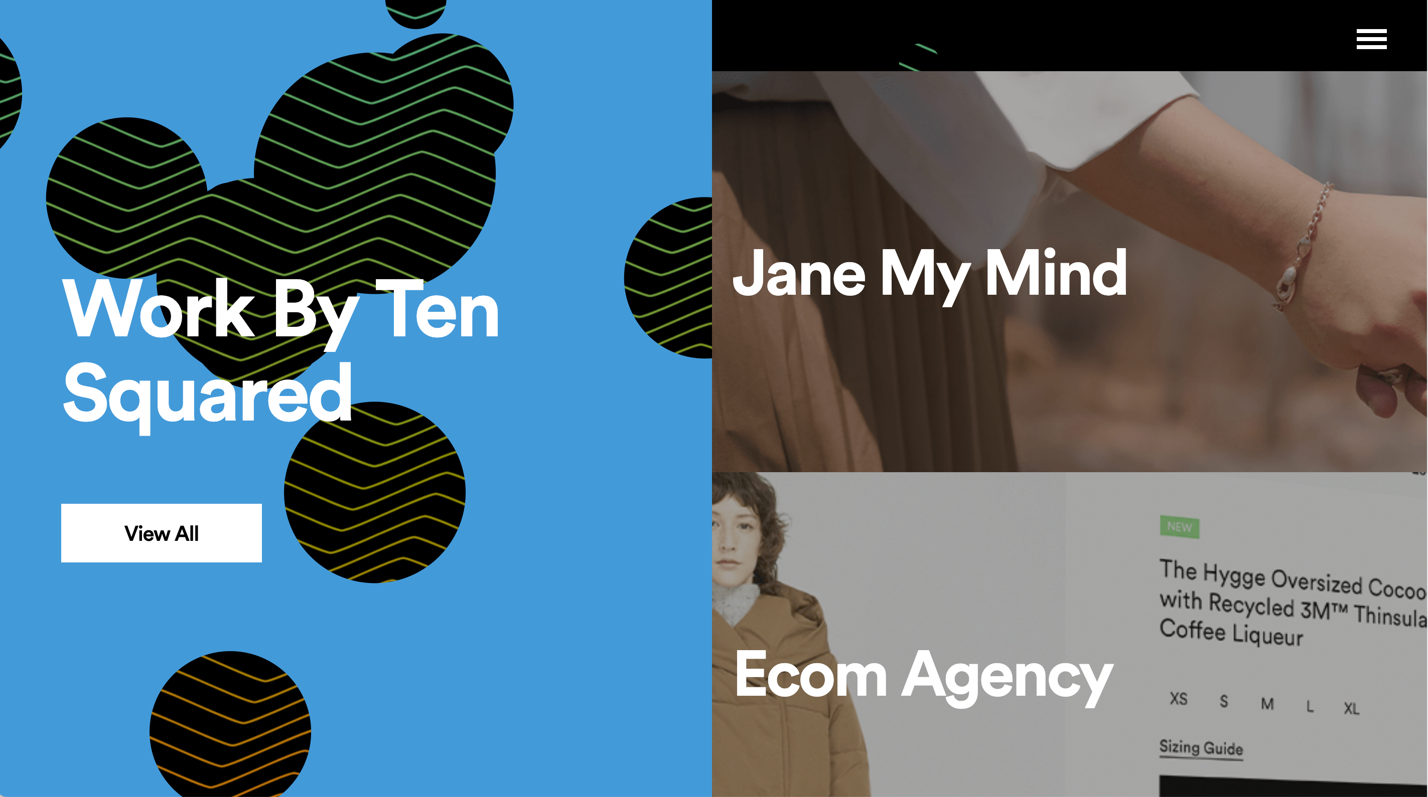
A Complete Overhaul - 2020
Following this version of the website we took a completely different approach, we removed almost all the content from the core of the website and transferred it into basic blog posts. We also made the choice to remove our project pages and instead allow our work to speak for itself. This resulted in a clean overall result, however, made SEO significantly harder. Our blog performed incredibly well and brought a significant amount of traffic to our website, in fact, our traffic overall more than tripled with this re-design following a strong focus on SEO through our blog.

This version of our website had a few benefits, firstly it was incredibly simple to navigate, it was easy to use, it was super fast and it showcased our work well with imagery. Hovering on each of the options within the hero would even give users a preview of what to expect if they clicked on each of the options.

When users hovered on our work it would cycle through our projects at the time displayed on devices in the real world designed to help individuals not only view the website but imagine how users might engage with these websites in the real world.

When users hovered on contact they were greeted by a bright neon sign saying hello, welcoming users to get in contact and start a discussion about their project.
Our Website Today - 2022
After being ridiculously busy with some incredible projects for quite some time we finally found some time to update our website to portray how far we have come. We will allow you to explore our current website for yourself. We loved creating this version of our website, it gave us a chance to develop some skills that we otherwise may not have had the opportunity to. Believe me, there is a lot of incredible stuff going on behind the scenes to help make this website a truly incredible one.
Summary
Whilst we are still only a young agency we have come a long way already, this is evident most in the evolution of our website across these years. We continue to learn and develop our skills every day working out how we as a team can do even better. The good news is that we are only just getting started.
